Is Wimborne White the Best Warm White Paint Color for 2026?
Wimborne White FB 239 by Farrow & Ball is becoming one of the most requested warm white paint colors for Philadelphia interiors in 2026 because it creates a soft, timeless look that feels brighter and warmer than stark white paint. It works especially well in historic Philadelphia homes, modern condos, living rooms, bedrooms, and spaces with changing natural light.
Soft, timeless, and full of warmth, Wimborne White FB 239 by Farrow & Ball continues to stand out as one of the most elegant white paint colors for Philadelphia interiors in 2026.
Unlike stark white paint colors that can feel cold or overly bright, Wimborne White creates a softer, more welcoming atmosphere while still keeping spaces fresh and refined. The color works exceptionally well in Philadelphia homes because it complements both modern interiors and historic architectural details.
In this recent Rittenhouse Square interior painting project, Groovy Hues Painting of Philadelphia used Wimborne White to brighten the space naturally while preserving depth, warmth, and character throughout the home.
Watch the Rittenhouse Square Transformation
Why Wimborne White Is Trending in 2026
Homeowners are continuing to move away from overly sterile whites and cooler gray undertones. In 2026, paint trends are leaning toward warmer neutrals, softer whites, and colors that create a calming, lived-in feel.
Wimborne White by Farrow & Ball fits that shift perfectly.
The color feels bright without looking harsh. It reflects natural light beautifully while maintaining warmth throughout the day. In Philadelphia homes with older architecture, detailed trim, crown molding, plaster walls, and historic millwork, Wimborne White helps highlight character instead of overpowering it.
This paint color works especially well for homeowners who want:
- A timeless interior color palette
- A softer alternative to bright white paint
- Warmth without yellow undertones
- Better balance in rooms with natural light
- A sophisticated neutral for modern interiors
- A paint color that complements historic Philadelphia homes
What Color Is Wimborne White FB 239?
Wimborne White is a warm white paint color created by Farrow & Ball. It has subtle creamy undertones that keep it from feeling too stark or clinical.
Compared to cooler whites, Wimborne White feels softer and more inviting. It adapts well to different lighting conditions and pairs beautifully with wood flooring, stone, brass fixtures, black accents, and natural textures.
The color was inspired by the white used in the village of Wimborne in Dorset, England, giving it a classic and timeless feel that works naturally in both traditional and contemporary interiors.
Why Wimborne White Works So Well in Philadelphia Homes
Philadelphia homes often feature architectural details that deserve to stand out. From historic brownstones in Rittenhouse Square to Main Line colonials and modern condos, the right white paint color can completely change how a space feels.
Wimborne White works especially well in Philadelphia because it:
- Softens natural shadows in older homes
- Brightens rooms without feeling sterile
- Complements original trim and molding
- Works beautifully with natural light
- Adds warmth to north-facing rooms
- Pairs well with both modern and historic interiors
In neighborhoods like Rittenhouse Square, Society Hill, Chestnut Hill, and the Main Line, homeowners are increasingly choosing warm white paint colors that feel elevated and timeless instead of trendy.
Best Rooms for Wimborne White
One reason Wimborne White remains popular is its versatility. It can work across an entire home or be used selectively in spaces that need softness and warmth.
Living Rooms
Wimborne White creates an inviting, relaxed atmosphere in living rooms while still keeping the space bright and elegant. It pairs especially well with natural wood furniture, textured fabrics, and black accents.
Bedrooms
In bedrooms, the color feels calm and peaceful without looking flat. The warm undertones help create a softer environment that feels comfortable throughout the day and evening.
Kitchens
Wimborne White works beautifully on kitchen walls and can also pair well with white cabinetry, brass hardware, marble countertops, and natural oak flooring.
Historic Philadelphia Homes
Older homes often have unique lighting conditions, plaster walls, decorative trim, and original woodwork. Wimborne White enhances these details instead of washing them out.
Hallways and Entryways
Because the color reflects light gently, it helps hallways and transitional spaces feel brighter and more open.
Wimborne White vs Bright White Paint Colors
Many homeowners initially think they want pure white walls until they see how stark bright white can feel in real lighting conditions.
Compared to cooler bright whites:
- Wimborne White feels softer
- It creates more warmth
- It reduces harsh contrast
- It feels more timeless
- It works better in historic homes
- It looks more natural in changing daylight
This is especially important in Philadelphia interiors where natural light can shift dramatically depending on the season, building orientation, and architectural layout.
Paint Trends for 2026: Warm Minimalism
One of the biggest interior paint trends for 2026 is warm minimalism. Homeowners want interiors that feel clean and modern without feeling cold or empty.
Warm whites like Wimborne White support this trend perfectly by creating spaces that feel:
- Bright but comfortable
- Modern but timeless
- Minimal but welcoming
- Neutral without feeling boring
Designers are pairing warm whites with:
- Natural oak
- Limewash textures
- Warm brass finishes
- Soft black accents
- Earth-tone fabrics
- Organic materials
- Layered neutral palettes
This combination creates interiors that feel elevated while still being highly livable.
What Paint Colors Pair Well With Wimborne White?
Wimborne White is highly versatile and pairs well with many modern and classic color palettes.
Popular combinations include:
- Soft taupe accents
- Warm beige tones
- Muted olive green
- Charcoal black
- Dusty blue
- Natural wood finishes
- Matte brass fixtures
- Cream textiles
- Warm gray upholstery
For trim and millwork, many homeowners choose either a matching soft white or a slightly brighter white for subtle contrast.
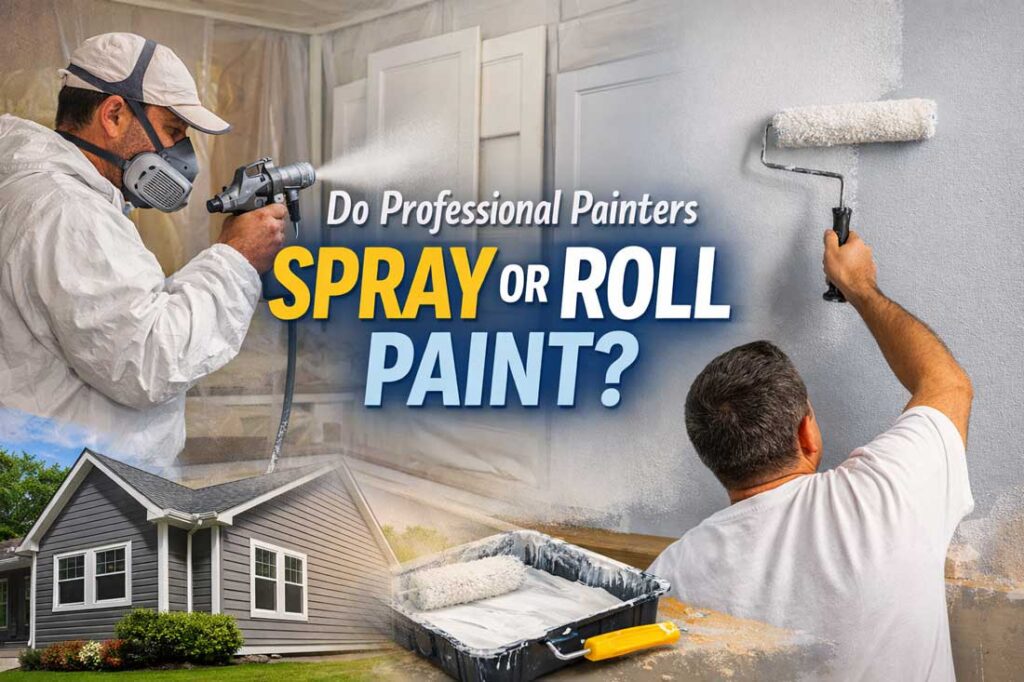
Professional Interior Painting Makes a Difference
Warm whites require careful preparation and clean application because imperfections can become visible in certain lighting conditions.
At Groovy Hues Painting of Philadelphia, we focus on:
- Smooth wall preparation
- Clean cut lines
- Proper lighting evaluation
- Premium paint application
- Detailed trim work
- Consistent finish quality
- Clear communication throughout the project
The goal is not just beautiful color, but a finished space that feels polished, balanced, and professionally completed.
Why Philadelphia Homeowners Are Choosing Farrow & Ball
Farrow & Ball continues to grow in popularity among Philadelphia homeowners because of its rich pigments, sophisticated tones, and designer-inspired color palettes.
Homeowners often choose Farrow & Ball when they want:
- More depth than standard paint colors
- Softer, more complex neutrals
- Historic character
- Luxury interior finishes
- Designer-level color palettes
- Timeless paint choices that age well
Wimborne White is one of the brand’s most versatile and enduring colors because it works across so many different home styles and lighting environments.
Frequently Asked Questions About Wimborne White FB 239
Is Wimborne White a warm or cool white?
Wimborne White is considered a warm white paint color with soft creamy undertones.
Does Wimborne White work in historic Philadelphia homes?
Yes. Wimborne White works exceptionally well in historic Philadelphia homes because it complements original architectural details and softens natural shadows.
Is Wimborne White too yellow?
No. While it has warmth, it does not typically appear strongly yellow. The color feels soft and balanced in most lighting conditions.
What rooms look best with Wimborne White?
Living rooms, bedrooms, kitchens, hallways, and dining rooms all work beautifully with Wimborne White.
Does Wimborne White work in modern interiors?
Yes. Wimborne White pairs well with modern interiors, especially when combined with black accents, natural wood, and warm minimalist design elements.
Can Wimborne White make a room brighter?
Yes. The color reflects natural light well while still maintaining warmth and depth.
Why is Wimborne White trending in 2026?
Homeowners are moving toward softer, warmer neutrals that feel timeless and comfortable. Wimborne White fits perfectly into the growing warm minimalism trend.
Explore Paint Trends With Groovy Hues Painting of Philadelphia
Choosing the right paint color can completely transform how your home feels. Whether you want a timeless warm white like Wimborne White or a custom color palette designed around your home’s lighting and architecture, Groovy Hues Painting of Philadelphia can help.
Our team provides professional interior painting services throughout Philadelphia, Bucks County, Montgomery County, Delaware County, and the Main Line.
If you are planning an interior painting project and want expert guidance on 2026 paint trends, contact Groovy Hues Painting of Philadelphia today for a consultation.
![How Much Does It Cost to Paint a House in Philadelphia? [2026 Guide]](https://www.groovyhues.com/philadelphia-pa/wp-content/uploads/sites/2/2026/06/how-much-does-it-cost-to-paint-a-house-in-philadelphia-2026-guide.jpg)