Fall Color Trends for Interior Painting in Media, PA
Expert Tips for a Warm Color Palette That Transforms Your Home
As fall settles into Media, PA, homeowners are turning to warm color palettes to bring seasonal comfort indoors. From burnt oranges to deep reds and cozy neutrals, this year’s fall color trends are inspired by Pennsylvania’s autumnal landscape and designed to transform your living spaces into cozy retreats.
Whether you’re updating a living room or giving your walls a seasonal refresh, you’ll find that this season’s color palette offers more than just beauty—it enhances mood, complements natural light, and creates lasting harmony throughout your home.
Warm Earthy Tones Are Defining Media’s Fall Interiors
Warm, earthy tones are more popular than ever across Media, PA homes. We’re seeing colors with warm undertones—like sienna, caramel brown, and olive green—dominate interior painting projects.
These autumnal color choices:
-
Reflect the changing outdoor scenery
-
Complement natural materials like wood and stone
-
Provide a grounded, welcoming vibe perfect for fall
Pairing sienna reds with warm gray paint colors or layering deep olives over taupe creates sophisticated contrast while keeping the space cozy. For even more depth, we recommend exploring Benjamin Moore shades like Charleston Gray or Terracotta Tile—they bring instant seasonal charm.
Cozy Neutrals with Warm Undertones
This fall, neutrals are going warmer. Media homeowners are moving away from cool grays and embracing warm-toned neutrals like:
-
Taupe with yellow undertones
-
Warm gray paint colors
-
Beige with sun-kissed warmth
These colors are ideal for maintaining brightness while introducing seasonal warmth into your living room, hallway, or bedroom. They reflect natural light beautifully and pair effortlessly with both bold fall accents and neutral decor.
Frosted Toffee by Benjamin Moore is a local favorite—it captures the cozy tone of the season without overpowering a space.
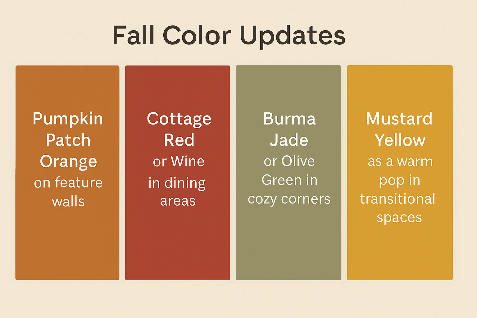
Bold Accent Colors Inspired by Fall Foliage
If you’re looking to create a dynamic contrast, bold color combinations are trending this fall. Homeowners in Media are pulling from nature’s most vibrant displays—burnt oranges, mustard yellow, plum, and wine—to make bold design statements.
Top fall color updates include:
-
Pumpkin Patch Orange on feature walls
-
Cottage Red or Wine in dining areas
-
Burma Jade or Olive Green in cozy corners
-
Mustard Yellow as a warm pop in transitional spaces
These colors, grounded in fall color inspiration, work well when paired with warm gray or natural taupe backdrops to create balanced, seasonal energy.
Seasonal Color Inspiration from Nature
Still not sure what direction to go? Look outside your door. Media’s fall landscape is packed with color inspiration that translates perfectly into interior design.
Try pulling your color scheme from:
-
Deep reds and oranges found in maple leaves
-
Golden yellow undertones from harvest sunflowers and wheat
-
Cool tones from evergreen trees for balance
-
Browns and terracottas from the earth and stone
Paint shades like Marigold, Orange Nectar, and Spicy Mix echo fall’s warmth while still feeling fresh and modern. For timeless versatility, Benjamin Moore’s Pumpkin Patch blends seasonal energy with sophisticated depth.

5 Trending Fall Color Combinations for Media Homes
Bring balance and personality to your home with these trending fall color combinations:
1. Burnt Orange + Taupe + Mustard Yellow
Creates a sun-kissed glow that’s perfect for entryways or kitchen nooks.
2. Olive Green + Warm Gray + Deep Red
Adds rustic elegance—ideal for cozy bedrooms and sitting rooms.
3. Wine + Warm Gray + Charleston Beige
A sophisticated, layered look for living or dining rooms.
4. Sienna + Steel Teal + Amazon Green
Bold yet earthy—great for accent walls and eclectic décor styles.
5. Marigold + Deep Olive + Soft White
Classic meets contemporary. Adds seasonal warmth without overwhelming the space.
These combinations help reflect Media’s stunning fall palette while maintaining long-term design appeal.
The Psychology Behind Fall Paint Colors
The colors you choose for your home do more than set a visual tone—they shape how you feel in the space.
How Warm Colors Evoke Coziness
Colors with warm undertones like caramel brown, pumpkin, and cottage red bring a natural feeling of comfort and closeness.
They:
-
Encourage connection and conversation
-
Make open spaces feel more inviting
-
Pair beautifully with seasonal textures like wool, leather, and wood
Use them in social areas such as kitchens, living rooms, and foyers for that instant “welcome home” feel.
How Earthy Tones Reduce Stress
Earth-connected hues like deep olive, sage, and terracotta are proven to lower stress levels and create a soothing atmosphere.
They work especially well in:
-
Bedrooms
-
Home offices
-
Reading nooks or retreat spaces
Earthy tones promote emotional balance, helping your home feel like a true sanctuary in cooler months.
How Bold Accents Create Energy
Strategic pops of color like mustard yellow, bright orange, or wine add warmth and excitement to any space.
Try these ideas:
-
Tangerine in creative workspaces for a boost in energy
-
Plum in entertainment areas for rich, intimate ambiance
-
Orange accents in foyers to create strong first impressions
These colors encourage engagement and keep your home feeling lively even as the days get shorter.
Transitioning from Summer to Winter Color Schemes
Fall in Media is the perfect time to make interior updates that carry you through winter.
Use these seasonal transition strategies:
-
Anchor your space with warm color neutrals like taupe and warm gray
-
Layer in autumnal accents like orange and deep green
-
Choose multi-seasonal paints like Charleston Gray that look great with both summer and winter décor
This approach allows for flexibility in accessories and textiles without the need for constant repainting.
Application Tips for a Flawless Autumn Paint Job
For your fall color trends to truly shine, proper application is essential. At Groovy Hues Painting, we recommend:
-
Color washing for subtle dimension on accent walls
-
Sponge painting to blend warm autumn tones like marigold and olive
-
Bold accent walls with pumpkin or wine shades
-
Two-tone layering for balance and depth
-
Always start with high-quality surface prep for the best results
Well-applied fall colors make a home feel not just current—but elevated.
Frequently Asked Questions
What Are Good Paint Colors for a Media Room?
Deep, immersive hues like Plum, Wine, and Burma Jade are excellent for media rooms. They enhance the viewing experience while providing warmth and comfort.
What Color Is Replacing Gray?
Warm neutrals like taupe, caramel brown, and beige with yellow undertones are replacing traditional cool grays. These offer the same versatility with more personality.
What Color Is Replacing White?
Soft warm whites and light taupes are becoming popular alternatives. They maintain a clean look but feel softer and more lived-in.
What’s the Most Popular Interior Paint Color Right Now?
Right now, Tres Naturale, Charleston Gray, and Pumpkin Patch are leading the way. These paint colors are flexible, warm, and perfect for fall and beyond.
Ready to Update Your Media Home With Fall’s Hottest Colors?
Whether you’re looking to refresh your living room or completely update your color scheme, fall is the perfect season to get started.
At Groovy Hues Painting, we specialize in warm color palette designs, color consultations, and professional application techniques that ensure your space feels like home—through fall and beyond.
Contact us today for a free color consultation and let’s bring fall inside.