Color Drenching Bedroom Walls: Trendy or Timeless?
Color drenching is having a moment. There’s a certain comfort in white walls — they’re safe, simple, and they make choosing curtains significantly easier. But more homeowners are moving away from that familiar blank canvas in favor of richer, more enveloping color schemes.
According to Fixr’s 2025 Interior Design Trends Report, 55% of design experts say color drenching will define the year’s biggest paint moments. Scroll through any interior design feed and you’ll find bedrooms wrapped in deep greens, moody blues, or soft blush from floor to ceiling.
But as the trend takes over Instagram and designer portfolios alike, one question lingers: is color drenching a passing moment, or the start of a more timeless way to decorate? The answer, it turns out, depends almost entirely on how you do it.
What Is Color Drenching?
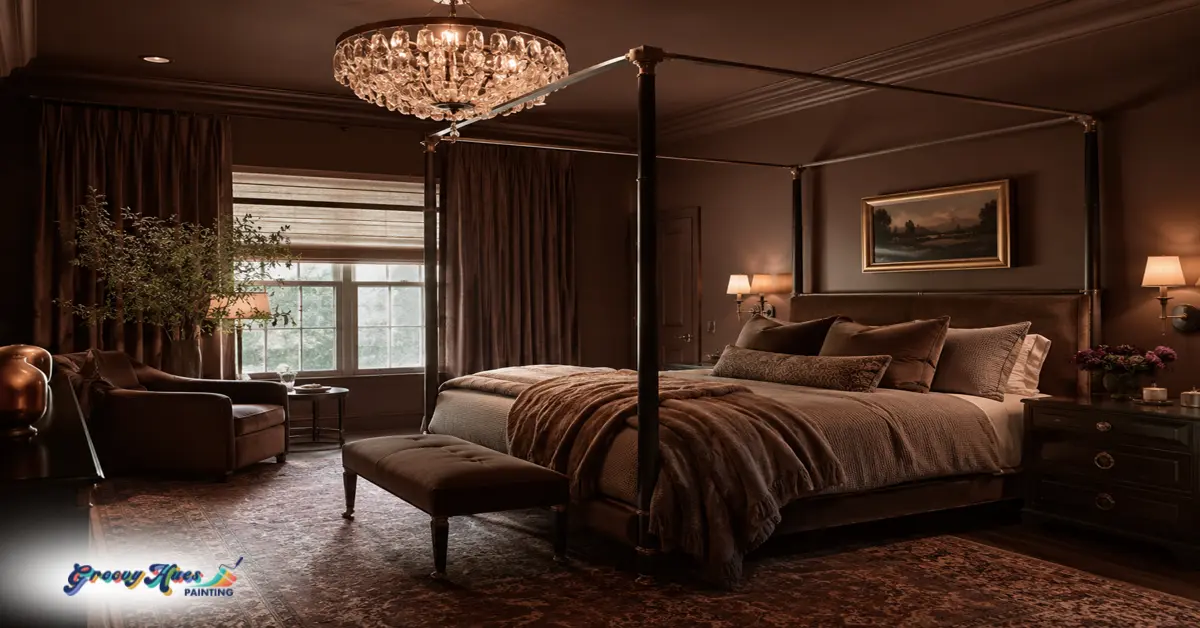
Color drenching means painting not just your walls, but your trim, ceiling, doors, and sometimes even built-in furniture in the same shade — or a closely related tonal family. Rather than breaking up surfaces with contrasting whites or a single accent wall, color drenching creates a unified, continuous effect that’s calm in softer tones and dramatic in deeper ones.
The technique isn’t as new as its Instagram presence suggests. Color drenching draws its lineage from the monochromatic interiors of early modernist design, where architects like Le Corbusier treated color as part of the architecture itself rather than decoration applied to it.
The 1960s modernist revival carried that idea forward, using single tones to make walls, ceilings, and built-ins read as one seamless composition. What’s new is the democratization of the look — social media, accessible paint brands, and a collective post-pandemic desire for more expressive, personality-driven homes have made color drenching the defining interior approach of the mid-2020s.
As Texas-based designer Shauna Glenn put it, 2025 is shaping up to be the era of “color drenched maximalism.” Brands like Sherwin-Williams and Farrow & Ball have responded with entire palettes built around monochromatic layering, and major publications from Architectural Digest to Better Homes & Gardens have championed its power to create calm continuity in residential spaces.
At Groovy Hues, we can help you create a custom monochromatic color drenched bedroom that makes you feel like you’ve stepped into a designer magazine. Find a Groovy Hues Painting contractor near you, or just give us a call to ask any questions you have about color drenching.
Why Color Drenching Works Especially Well in Bedrooms
The bedroom is the one room in the house where atmosphere matters most. It’s where you unwind, decompress, and — ideally — sleep deeply. Color psychology research confirms what good designers have always known: the colors surrounding us in that space affect how we feel in it.
- Blue tones have been linked to lowered heart rate and reduced blood pressure.
- Soft greens evoke calm and reduce eye strain.
- Warm neutrals and blush tones create the sense of warmth and safety that makes a room feel genuinely restful.
Color drenching amplifies those effects. When the same hue wraps every surface — walls, ceiling, trim, even bedding — the room stops feeling like a box with four sides and a lid. It becomes an environment. According to color expert Sue Wadden, deeper monochromatic schemes can make small bedrooms feel cocoon-like rather than closed-in, a counterintuitive but well-documented effect when the right color is chosen.
Interior designer Elissa Hall of EDH Interiors describes color drenching as “a cozier, more timeless evolution of accent walls,” adding, “I want to feel enveloped by color.” Designer Letecia Ellis Haywood agrees, noting the trend has staying power precisely because “people are craving moody and cozy spaces” — a craving that isn’t going away regardless of what’s trending on social media.
Beyond atmosphere, color drenching solves a practical design problem. Oddly shaped rooms, rooms with low ceilings, rooms with mismatched architectural details — all of these benefit from the visual smoothing effect of a single continuous color. By eliminating the contrast between wall, trim, and ceiling, you eliminate the lines that define the room’s awkward geometry. The result often feels more spacious, not less.
Trendy or Timeless? The Honest Answer
Here’s where it gets nuanced. Color drenching can be both — and the difference is almost entirely in the execution.
When it reads as a trend
Bold, highly saturated drenching in colors that are very much of this moment (certain neons, aggressively trendy terracottas, trendy pastels) is likely to date itself within a few years. Social media-driven color choices, especially those that are heavily tied to a single design moment, tend to have a shorter shelf life.
When it endures
Color drenching in warm earth tones, deep blues, soft sage greens, or quiet blush shades is rooted in something older and more durable than a trend cycle. Interior designer JoAnna Baum puts it well — to her, color drenching “feels centuries old and intentional.” A deeply satisfying navy blue bedroom wrapped from baseboard to ceiling has the same timeless quality as a well-upholstered chair or a hardwood floor. It reads as a considered design decision rather than a moment’s impulse.
The distinction is really about color choice and execution rather than the technique itself. Monochromatic interiors have appeared in every era of design history. The reason color drenching endures is that it’s fundamentally about making a room feel whole — and that goal doesn’t go out of style.
Complementing the color drenching trend, 49% of design experts say warm neutrals and 48% say dark, earthy greens will continue rising in popularity through 2025 — which are also among the most versatile and enduring choices for a color-drenched bedroom.
Choosing the Right Color
The color you choose determines everything about whether your color-drenched bedroom feels sophisticated or overwhelming. A few key considerations:
-
Lighting first.
A color that looks rich and warm in a showroom can read muddy or oppressive in a north-facing bedroom that gets limited natural light. Test large paint swatches — at least 12 inches square — directly on your walls, and observe them at different times of day and under both natural and artificial light before committing. Pay attention to the color’s Light Reflectance Value (LRV): higher LRV means the color reflects more light and will feel lighter in the room; lower LRV produces a more enveloping, moody effect.
-
Choose calming colors.
Popular drenching colors for bedrooms that consistently perform well across different room sizes and light conditions include sage green (calming, nature-forward, endlessly versatile), navy blue (timeless, grounding, excellent for sleep), soft blush (warm and intimate without feeling bold), charcoal (dramatic when done right, particularly effective in rooms with good natural light), and warm terracotta or clay tones (earthy and cocooning, especially in rooms with warm undertones in the wood or textiles).
-
Consider undertones carefully.
Two shades that look similar on a chip can read very differently on a full room. A sage with yellow undertones will feel warmer and more organic; the same green with blue undertones will feel cooler and more serene. Choosing the wrong undertone for your room’s existing wood tones, light sources, and textiles is the most common reason color drenching projects disappoint.
-
Think about room function.
Blue tones and soft greens support sleep and calm — ideal for a primary bedroom. Warmer shades like terracotta or blush add energy and intimacy, making them excellent for rooms that function as both sleeping and dressing spaces. Very dark colors work best in rooms with at least one strong source of natural light to prevent the space from feeling oppressive.
Are you ready to color drench your bedroom? Call Groovy Hues to speak with a design expert, or find a painting contractor near you to get started.
Tips for Executing the Look
Getting color drenching right is as much about process as it is about color selection.
Use high-quality paint in the right finish.
For walls, a flat or matte finish conceals imperfections and creates the soft, enveloping look that makes color drenching so effective. Avoid high-gloss finishes on large surfaces — they amplify every bump and brush mark. For trim and ceilings where you want very subtle differentiation without contrast, a satin finish in the same color adds depth without disrupting the monochromatic effect.
Prep is everything.
Because there are no contrasting colors to draw the eye away from the walls, any surface imperfections become highly visible. Fill nail holes, skim coat any uneven patches, and sand trim smooth before painting. The more seamless the surfaces, the more seamless the final result.
Explore variations on the technique:
- Double drenching uses the same hue at slightly different sheens — matte on the walls, satin on the trim — to create subtle differentiation without disrupting the monochromatic palette.
- Tonal layering steps slightly deeper or lighter on different surfaces. Walls in a mid-tone sage, ceiling in a lighter value of the same green, built-ins in a slightly deeper tone — the palette stays unified while gaining dimension.
- Texture contrast is what keeps a fully drenched room from feeling flat. Linen bedding, a natural wood headboard, metallic light fixtures, a woven rug — all of these introduce visual interest without introducing a competing color. The color stays consistent; the surfaces do the talking.
If you want depth without breaking the palette, consider pairing painted walls with a tone-on-tone wallpaper in the same color family.
DIY or Hire a Pro?
Color drenching looks deceptively simple — it’s just one color, after all. In practice, it’s one of the more technically demanding paint projects a bedroom can present. Painting ceilings and trim to match walls requires precise cutting-in, consistent coverage across very different surface textures, and the patience to apply enough coats that the color looks saturated and even rather than thin and streaky.
Darker colors amplify every imperfection and every missed spot. Getting truly seamless coverage across walls, trim, and ceiling — the kind that looks intentional rather than accidental — is where professional application makes the biggest difference.
Groovy Hues’ interior painting services are designed exactly for this kind of project: precise prep, expert color consultation, and application that delivers the smooth, saturated coverage that makes color drenching look sophisticated rather than overwhelming. A skilled team knows how to balance saturation, finish selection, and lighting to ensure the final room feels cohesive — and like the bedroom you imagined when you first scrolled past that perfectly drenched navy blue room at midnight.
Find a Groovy Hues painter near you to get started.
Frequently Asked Questions About Color Drenching a Room
Does color drenching make a bedroom feel smaller?
Not usually. Using one color across walls, trim, and ceilings can create visual continuity that makes a room feel larger and more cohesive. Lighter shades feel more open, while darker shades create a cozy, cocoon-like effect.
What colors work best for color drenching a bedroom?
Soft greens, warm neutrals, deep blues, earthy clay tones, and muted charcoals are popular choices. These colors create depth without feeling overwhelming or overly trendy.
Do walls, trim, and ceilings need to be the exact same paint?
No. Many color-drenched rooms use the same color in different sheens or slightly varied shades. The goal is to maintain a cohesive monochromatic look without strong contrast lines.
Is color drenching a good choice for a small bedroom?
Yes. Lighter or warmer tones can make a small bedroom feel intentional and inviting. Very dark colors work best in rooms with good natural light.
Will a color-drenched bedroom go out of style?
The technique itself is timeless. Neutral earth tones, soft greens, and deep blues tend to stay current longer than highly trend-driven colors.
Final Thoughts
Color drenching bedroom walls can be both trendy and timeless — the determining factor is how thoughtfully it’s executed. In the right color, applied with precision across walls, ceiling, and trim, color drenching transforms a bedroom from a place you sleep in to a place you genuinely want to be. In the wrong color, or applied without the prep and technique it demands, it can feel like a project that didn’t quite land.
That’s exactly the kind of project where professional guidance makes the biggest difference — in color selection before a single brush stroke, and in application quality when it counts.
Ready to drench? Call Groovy Hues at (844) 394-8660 for a color consultation, or contact us online — and we’ll help you find the color that makes your bedroom feel like exactly the room you’ve been trying to create.