Painting Walls and Trim the Same Color: A Modern Design Trend Explained
For generations, the formula was simple: walls get color, trim gets white. That contrast was so standard it barely registered as a design choice.
That formula is quietly being retired. Across interior design feeds, showrooms, and newly renovated homes, a different approach is gaining ground: painting walls and trim in the same color, creating a seamless, enveloping effect that feels simultaneously modern and deeply considered. According to a 2023 Houzz U.S. Home Design Trends Study, 45% of homeowners now prioritize cohesive color schemes when remodeling, and painting walls and trim the same color is one of the most direct ways to get there.
This guide breaks down why the trend works, which colors and finishes pull it off best, where it shines brightest, and what it takes to execute it properly. If you’re ready to move beyond the white trim default, Groovy Hues’ interior painters can help you get there — with the precision and color expertise to make it look intentional, not accidental.
Why Painting Walls and Trim the Same Color Is Gaining Popularity
The shift away from contrasting white trim isn’t arbitrary. It reflects a broader move in interior design toward spaces that feel cohesive and purposeful rather than assembled from separate decisions.
Minimalism and cohesion.
When walls and trim share the same color, the room reads as a unified composition. There’s no visual interruption — no sharp white line pulling the eye away from the wall and down to the baseboard. The result is a space that feels thought-through from floor to ceiling.
It works across design styles.
This isn’t a look reserved for ultra-modern loft apartments. Same-color trim works beautifully in modern homes with clean architectural lines, in transitional spaces where traditional and contemporary details coexist, and even in historic homes where ornate molding becomes part of the design story rather than a leftover feature to be highlighted in white. Designers describe it as a “fresh alternative to standard white trim” that gives a room a “polished and intentional design vibe” that’s “versatile — whether you lean classic, modern, or somewhere in between.”
Small spaces and large ones both benefit.
In a powder room or hallway, same-color trim removes the visual choppiness that makes tight spaces feel cramped. In a larger living room or dining room, it adds a sense of luxe, envelope-like depth that’s harder to achieve with contrast.
The cultural moment supports it.
Color drenching — painting walls, trim, cabinetry, and ceilings in a unified color — is the top color trend for 2025, with 55% of design experts saying it will define the year’s paint moments. Matching walls and trim is the entry point into that world, and it’s where most homeowners start.
The Visual Effects of Same-Color Trim
Understanding why this works helps you make better decisions about where and how to use it.
It reduces visual contrast — and that’s a good thing.
Traditional white trim creates a sharp boundary line wherever walls meet baseboards, door casings, and window frames. That contrast draws the eye to the edges of the room, which in smaller spaces makes those boundaries feel closer and the room feel tighter. When trim and walls share the same color, those boundary lines soften. The eye moves around the room more freely instead of stopping at every edge.
Architectural details become part of the design, not a contrast element.
White trim tends to make molding, baseboards, and door casings pop as distinct features — which can work beautifully, but also means every imperfection is highlighted. With same-color treatment, those details become texture and dimension within the overall composition. Intricate crown molding painted the same deep olive as the walls creates drama through shadow and depth rather than contrast.
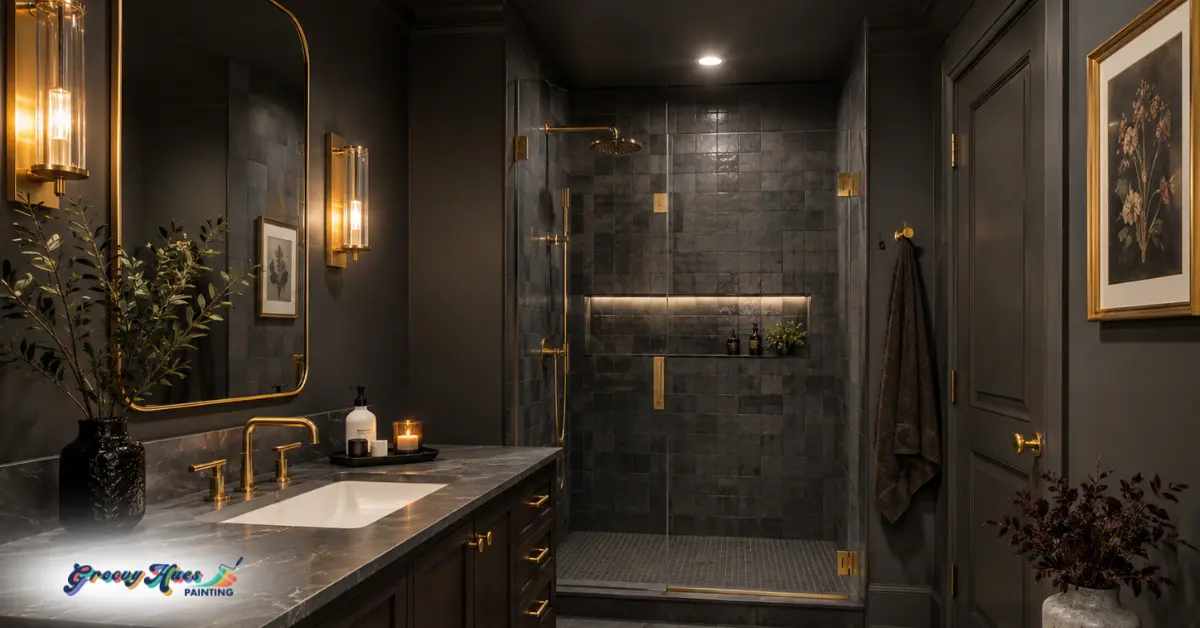
Darker colors add depth and drama.
Designers are embracing hues like emerald green, oxblood, and midnight blue to build spaces that feel bold, moody, and cinematic — and painting trim in the same tone is what makes those colors feel immersive rather than like a single wall got away from the rest of the room. The continuity is what creates the effect.
Lighter tones feel airy and expansive.
Soft greige, warm white, or pale sage used across walls and trim in a room with good natural light creates a quietly sophisticated atmosphere — cohesive without being dramatic, refined without being boring.
Best Color Choices for This Look
Not every color lands equally well in the same-trim treatment. Here’s a practical guide by palette family:
Soft Neutral Colors
Soft neutrals like warm beige, greige, putty, and off-white are the most universally accessible starting point. They create a cohesive, lifted look without committing to strong color, and they read as intentional without being bold. Warm neutrals remain a top trend for 2025, cited by 49% of design experts, and they’re the safest choice for homeowners who want the seamless look without a strong color statement.
Warm Earth Tones
Earth tones like terracotta, clay, warm olive, and ochre bring warmth and organic richness to a room. These shades look especially striking in spaces with natural wood furniture, linen textiles, and warm metal fixtures. Mocha brown, olive green, terracotta, and clay pink are dominating walls, furniture, and textiles in 2025, replacing the cooler neutrals of previous years.
Dark, Bold Tones
Deep tones like navy, charcoal, forest green, and black are the most dramatic application of this technique and the one that most fully delivers the cinematic, enveloping effect designers have been championing. Deep jewel tones and rustic browns are cited by 34% of design experts as top color choices for 2025. These work best in rooms with strong natural light or deliberately warm artificial lighting.
Subtle Pastels
Muted pastels like sage, dusty rose, pale blue, and lavender offer a softer, more romantic version of the same-trim look. They’re particularly effective in bedrooms and powder rooms where the goal is atmosphere over drama.
For a deeper look at which specific colors are trending right now, Groovy Hues’ guide on top interior design and house painting colors is worth browsing before you commit.
How Sheen Affects the Look
Paint finish is as important as color when painting walls and trim the same shade, and getting it wrong can undermine the whole effect.
The most widely recommended approach among professional designers is matte or flat on walls, satin on trim. This is the sweet spot for same-color treatments: both surfaces share the same hue, but the slight sheen difference on the trim provides subtle visual definition that prevents the room from feeling completely flat. The trim still reads as trim — it just doesn’t announce itself with white contrast.
- Matte walls absorb light, create depth, and are forgiving of surface texture and minor imperfections. They give the room that soft, enveloping quality that makes same-color treatments so appealing.
- Satin trim reflects slightly more light, is more durable and cleanable than matte (important for baseboards and door casings that take daily wear), and provides just enough differentiation to give the room dimension without disrupting the cohesive palette.
Avoid using the same sheen on both surfaces — flat trim looks dull and wears poorly, while high-gloss walls amplify every surface imperfection. And never accidentally swap the sheens — matte trim against satin walls flattens the room in all the wrong ways. This is one of the more nuanced aspects of the look, and one where professional guidance on product selection makes a real difference. Want to speak with a professional painter? Contact Groovy Hues online, find an interior painter near you, or give us a call to talk through what you have in mind and what your next steps are.
When and Where It Works Best
Same-color trim is versatile, but some spaces benefit more than others.
- Powder rooms and small bathrooms are the ideal starting point. The small footprint means the color commitment is manageable, the seamless treatment makes the space feel larger than it is, and you can be bolder with color than you might risk in a larger room.
- Hallways and entryways benefit enormously — these are often awkward, narrow, high-traffic spaces with lots of trim detail (baseboards, door casings, chair rails). Same-color treatment smooths all of that out and makes the space feel intentional and welcoming.
- Living rooms and dining rooms are where this look truly delivers its most luxurious effect. A deeply saturated navy or forest green dining room with same-color trim, warm lighting, and rich textiles is one of the most striking interiors achievable without a renovation.
- Modern homes with minimal molding are natural candidates — the clean, uninterrupted look of the same-color trim reinforces the architectural simplicity.
- Historic homes with ornate molding are perhaps the most surprising beneficiary. Rather than removing original millwork to modernize, painting it the same color as the walls transforms it from a traditional-looking accent into a sophisticated architectural texture.
Before You Commit: What to Consider
Same-color trim is a confident design choice — and a few variables are worth thinking through before you pick up a brush.
Lighting matters enormously.
Darker colors absorb light, which can make a north-facing or low-light room feel smaller and heavier than intended. Assess your room’s natural light at different times of day before committing to a deep or saturated tone. If you love the color but the room is dim, consider a lighter value in the same hue rather than scaling back the concept entirely.
Surface imperfections become more visible, not less.
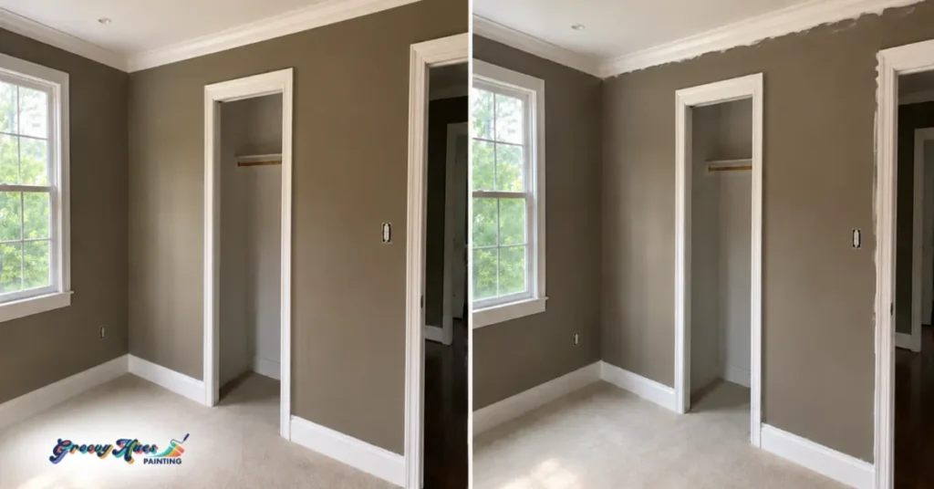
White trim creates contrast that distracts the eye from small dings, uneven texture, and patchy repairs. Same-color treatment does the opposite — it unifies the surfaces, which means any imperfections the prep work didn’t address will show. This is a significant reason why proper prep and professional application matter so much for this particular look.
Commit to the concept.
Same-color trim reads as intentional and sophisticated when executed consistently. Doing walls and trim but leaving the ceiling white, or doing some trim but not all of it, creates a half-finished effect that doesn’t capture the cohesion that makes the look work. If you’re going to do it, do it fully — and plan the color choice carefully, because the impact is whole-room.
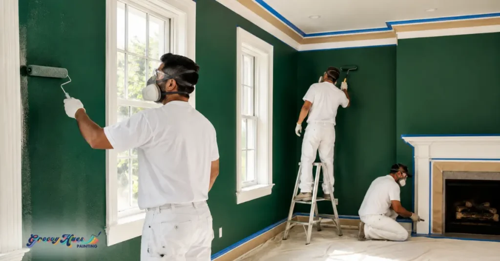
Professional vs. DIY: Should You Hire a Painter?
Here’s what makes this particular look especially demanding: because walls and trim share the same color, every line and edge is defined solely by the quality of the application — not by the contrast between two different colors.
Before you decide whether you’re up for the challenge, ask yourself these four questions:
- How much trim detail does the room have? Simple baseboards and basic door casings are manageable for a confident DIYer. Crown molding, wainscoting, panel molding, or built-ins require consistent brush pressure and angle across complex profiles — the kind of muscle memory that takes real practice to develop.
- Are your walls and trim in good condition? Same-color treatment is unforgiving of surface imperfections. If your walls have patches, texture variations, or your trim has gaps, dents, or old caulk lines, that prep work needs to be done thoroughly before a single coat goes on. Be honest about whether you have the tools, time, and patience to do it properly.
- How much does the result matter to you? A powder room you’re experimenting with? DIY is a reasonable call. A living room, primary bedroom, or a home you’re preparing to sell? The stakes are higher — and so is the cost of a result you have to live with or redo.
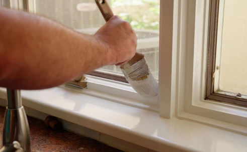
- Do you have experience cutting in without tape? Because walls and trim are the same color, painter’s tape won’t save you the way it does on a two-color job — the line between matte wall and satin trim needs to be cut in freehand with a steady hand and a quality angled brush. If that makes you nervous, it should factor into your decision.
If you answered “pro” to two or more of those, it’s worth a free, no-obligation conversation with Groovy Hues.
Our painters bring product knowledge, prep discipline, and color consultation to deliver the seamless, consistent coverage this look demands. Interior painting delivers an average ROI of 107% — and a cohesive, professionally executed color scheme is one of the strongest signals of a well-maintained home.
Explore interior painting services, browse all of Groovy Hues’ services, or learn more about the home value impact of a professional paint job.
Frequently Asked Questions About Painting Walls and Trim the Same Color
Does painting trim the same color as walls make a room feel smaller?
Not usually. Using the same color on walls and trim creates visual continuity that can make a room feel larger and more cohesive. Lighter shades help smaller rooms feel more open, while darker shades create a more dramatic effect.
Do I need different paint finishes for walls and trim?
Yes. Walls are typically painted in matte or eggshell finishes, while trim is usually satin or semi-gloss for added durability and subtle contrast.
What’s the easiest room to try this look in?
Powder rooms, hallways, and small bedrooms are popular starting points. Smaller spaces make it easier to experiment with color-drenched or monochromatic designs.
Can this work in rooms with detailed trim?
Yes. Using the same color on crown molding, wainscoting, or decorative trim can highlight architectural texture while creating a cleaner, more modern look.
How do I choose between light and dark colors?
Rooms with strong natural light can handle deeper, darker colors more easily. Smaller or darker rooms often work best with lighter neutrals, muted earth tones, or soft pastels.
Ready to Ditch the White Trim?
Painting walls and trim the same color is one of the most impactful, highest-design-value changes you can make to a room without touching the architecture. It’s bold without being loud, modern without being cold, and — when the color and execution are right — the kind of detail that makes a room feel like it was designed rather than decorated.
Getting it right means choosing the right color for your light, the right sheen for each surface, and the right prep to make every edge and transition look seamless. That’s where Groovy Hues comes in.
Call us at (844) 394-8660 to schedule a free color consultation, or contact us online to get started. Find your nearest Groovy Hues location and let’s talk about what your walls — and your trim — could look like.